2008 · for the Historians of Islamic Art Association
HIAA Logo Proposals
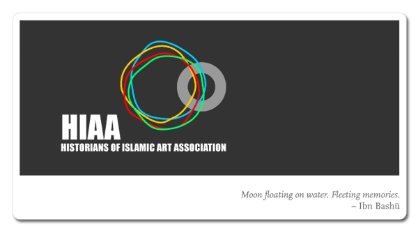
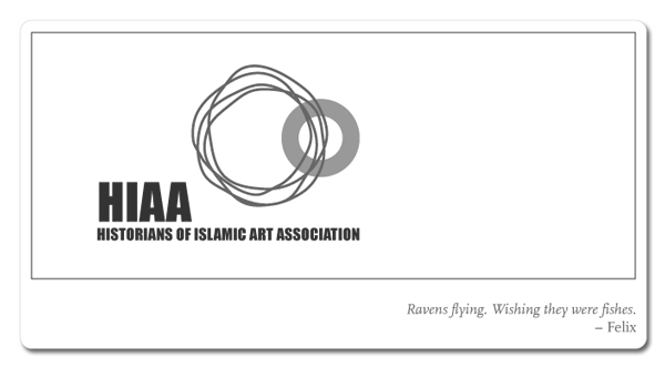
The first two logos are a representation of the moon: the celestial body as a gray ring and its perception by humans as circles of various colors. The underlying idea is that of an intangible reality, of which there are many representations. This idea is found in the three elements making up the HIAA acronym: the work of interpretation done by historians, the variety of Islamic Art and the multiplicity of viewpoints arising from an association. The moon was chosen because it is a common element across Islamic traditions and one that rhythms life in Islam. – But this is not the only interpretation of the logo. The imprecise circles approximating the perfect ring could be the quest of the absolute or experience when compared to theory. The simplicity of the design makes its interpretation open.
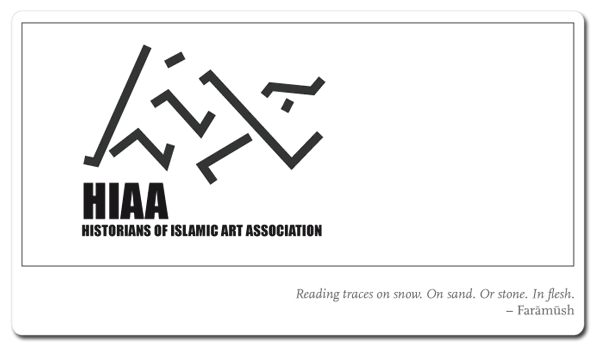
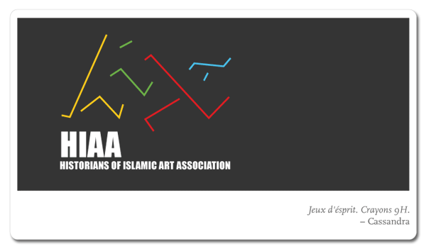
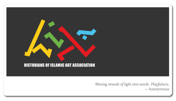
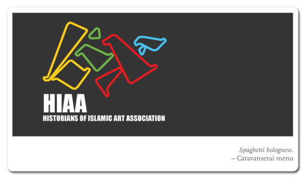
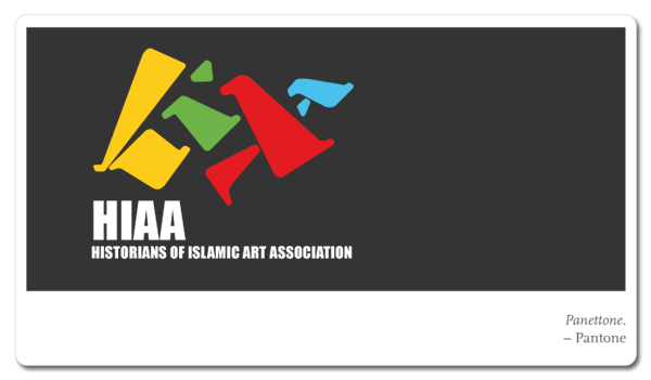
The next logos are based on another common element of Islamic cultures, the reverence of script. A feeling of tension inside the writing is conveyed to the onlooker, created from a graphical tension between the rigidity of the angular strokes and the liveliness of their variety in size, shape and orientation - like a dance. Although the width of letters differ, the two logos should be considered as being the variants used for black-and-white and color display. In fact the other logo too are declined in these two versions.
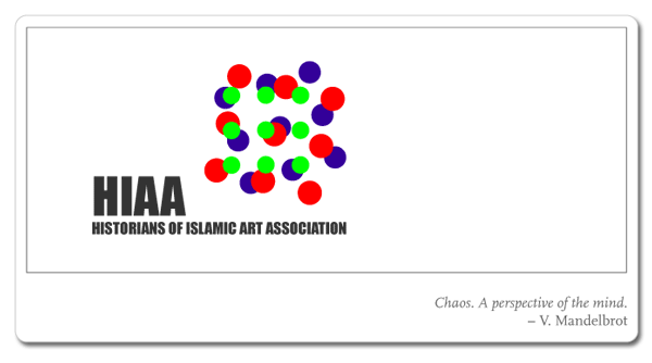
The last logo also draws on a stylized representation of the moon and the many shapes of its crescent when sun and earth revolve around it. The apparent chaos is however an orderly pattern of three groups of nine circles slanted at different angles.