2010.08.27
Business card for a textile conservator
Selection rationale
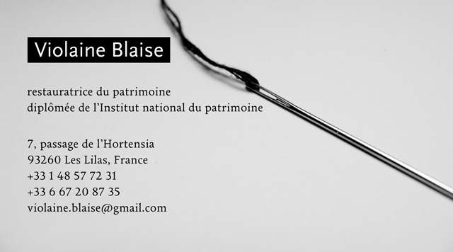
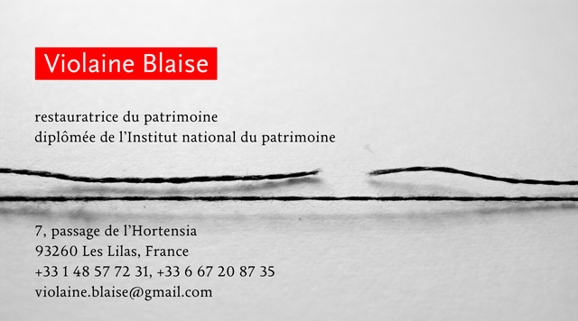
Elegance and craftsmanship
This is among all designs the most elegant and simple. The simplicity lies in the reduced number of semantic elements and graphical characteristics in the image, while the elegance comes from the combination of simplicity with rich details in each element – fine fonts, use of blur in the image, tufted thread contrasting with the smooth metal, non-uniform lightness of the background. It also conveys the most understandable message: a presentation of the tools of the craft, i.e. a needle and a thread. Overall there is a feeling of quietude and confidence in this image, retained as the winning design.
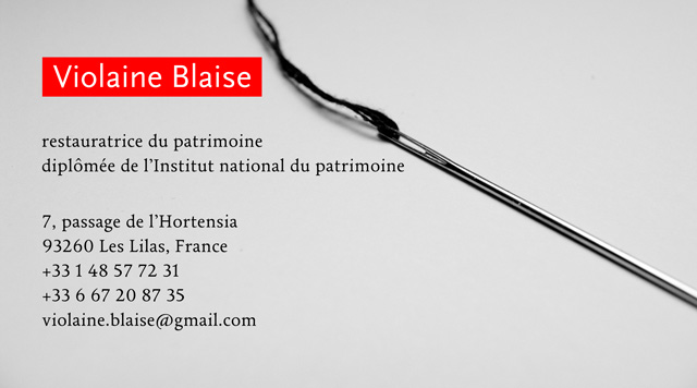
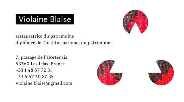
Class incompatibility
This was a tentative to enliven the atmosphere, but it produced an incompatibility between the joy represented by the red object and the composure of the remaining elements.
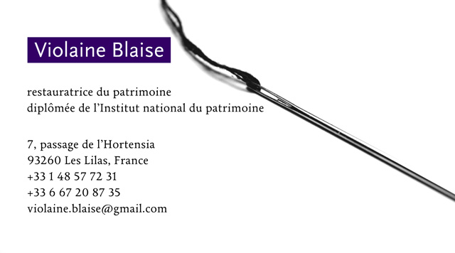
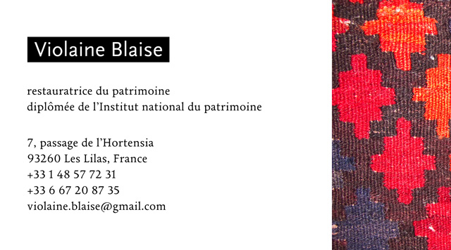
Manichean design
This is a compromise between the preceding designs, introducing some color, but not as strong as red. Another parameter was changed, the contrast, which removes the tranquility suggested by the gray background and replaces it with something equivalent to a powerful statement – i.e. the design changes from a picture to a drawing. Maybe too much, since with the exception of the shadow all shades are gone and with it some of the designs character.
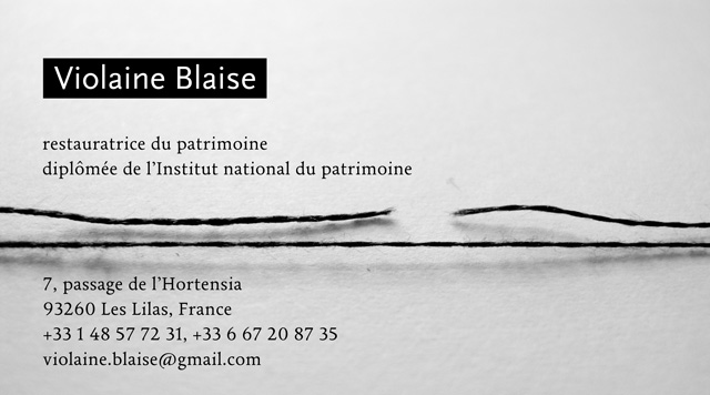
Funeral design
While close to the winning design, this one lacks the former's dynamism – all elements are linear – and it is unclear what the message should be – ok, the broken and the intact threads represent "conservation", but what more? Curiously the absence of movement transforms the absence of color in the image in a feeling of sadness. The meaning of the picture still being uncertain, it combines with the visually determined sadness to create a new feeling, of dread, related to the broken thread, that now looks like the result of violence concluded by death. (Note that the needle's point, it dangerous part, is not visible in the winning design, i.e. there's violence is avoided in it.)
Smart & modern
This design has achieved what the "red" variant of the winner tried: a dynamic, modern, smart image. (Dynamism = red contrasting with black and white; modern = computer smooth lines, yet humanly rich in details; smart = the concept of restoration simply conveyed by two threads.)
Lost illusion
This implements the initial idea of the design series – the optical illusion called "Kanisza triangle" in which the brain completes the missing parts of the white triangle suggested by the cuts in the disks, as a metaphor of the work of a textiles restorator, who needs to fill-in missing parts of objects. Unfortunately the unbalancing between the various elements make an unpleasing design.
Meaningless
Technically not faulty, but utterly conventional. Or better: a mindless design where the graphical choices are arbitrary, they don't provide for a meaning that would warrant their presence (the Middle-Eastern textile could have been as well a Japanese or any other one – compare this to the needle and thread of the first image which represent the craftsman core tools, or the arbitrary, but brilliant idea of the intact and broken thread of teh second design).
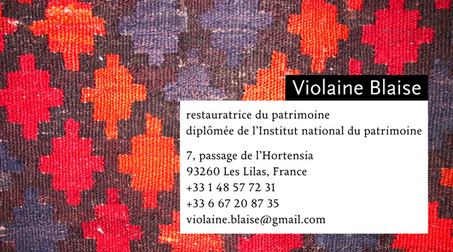
And a coffee please!
The idea behind this design was to put forward / give as much space as possible to a beautiful textile pattern. The result is not bad, but it would be more appropriate for a book cover or an exhibition poster, than a business card. Probably because of the too "emotional" component, the colorful pattern looking like an opulent dessert, on a par in graphical importance with the restorator's name and contact details.
Post Scriptum
It seems that the common needle used in the first design is for textiles restorators something like a stake - they use tiny chirurgical needles instead. So it was the slightly modified second design that was retained.
